Domestic Animal Behaviour Centre Branding
As part of our Convergence journey, we have continued our progress with logos and branding, this blog entry focuses on how myself and my team responded to a brief set by James Field.
The brief was a simple one in that we were to design a logo for a new domestic animal behaviour centre that would “appear on a range of different marketing outputs and business documentation.” They wanted to be branded specifically close to dogs and their owners with other animals such as cats and rabbits being a secondary demographic. I felt that a logo that can be recognised as a professional, educational and qualified would positively reinforce the company’s values to potential customers & partners.
Initial Ideas:
The group and myself said that we would focus on our own ideas and build upon then before later meeting to discuss our findings.
In the last blog post I looked at logos and their vast imaginative urges to reform and experiment and what the current contemporary trends were – I came to the conclusion that flat design is currently at its midpoint and that a mix between flat and skeuomorphism would be the trend in the next 3-7 years. One of the ideas I had was to incorporate a mix between the two but lean more towards the flat design as I feel it’s friendlier and would give an aesthetically pleasing look while also appearing professional, respectful and playful which is the clients wanted. The decision to have this mix was to give the logo a longer life period. I too thought that pastel colours would work well with the flat look as pastel colours tend to give off a very minimalistic stylization that could potentially be eye pleasing.
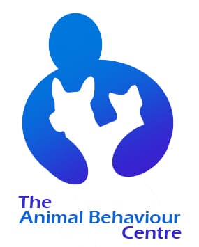
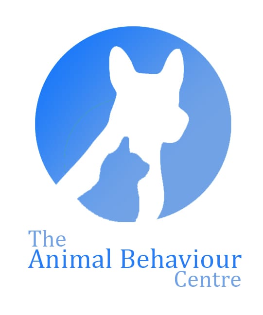
The dog was the main emphasis in all of my logos with secondary animals such as cats, rabbits and birds being in the background of the logos or not of as significance – a point in the design brief that the client clearly wants addressed. Silhouettes happened to be quite frequent in my research of other animal logos, mainly with the smaller animal being encapsulated within the larger; in my first few logos I addressed this by using silhouettes in a different, unconventional way.
Concept Logo Development:
The group and I discussed that the animal behaviour centre’s initials stood for ABC and considering that they clients wanted an educational approach we thought that this might be a clever way of doing it. I began adding new elements over the first 3 logos before finally settling on one I liked and would develop further.
![]()
![]()
![]()
The third logo is very similar to the logos seen in shops such as ‘PetsAtHome’ and other animal related business. I took this and developed the colours as after speaking to members in the group we came to the conclusion that the logos colours gave off a very scary and doom impending corporation which you wouldn’t really want to leave your dog with to attain better behaviour.
![]()
![]()
![]()
A colour wheel was used to produce the colours for the fourth logo, these fit very well and don’t clash, although the basic shape elements of the logo are still in the over used animal inside of another animals silhouette. This is why in the 5th and 6th logo a Ying and Yang effect was brought into effect with colours that represents them as opposites. This was done as it gives the impression that one is good and one that is bad – this links into the animal behaviour centre in what they do to help train and calm down unobedient pets.
![]()
![]()

Fine tuning was used on the colours of the logos to produce this final look – I found that when creating these logos that there is a triangle with 3 points focusing on different matters, and that you can only pick 2 without harming the third point. The logos above I feel have a professional and aesthetically pleasing look but don’t look fun. This brings me onto my next logo which I designed to be more fun.
![]()
The mix between skeuomorphic and flat design was used here to create a cartoon dog that was detailed with shadows, gradients and additional features. The French Bull Dog has a very fun and friendly vibe to it which in retrospect feels like it would be more suited for getting children to engage with a particular subject revolving around dogs. This logo doesn’t focus on tackling the domestic animal behaviour centres role in society; it doesn’t show what the organisation does other than the text obviously stating it. In regards to the triangle it fits a fun and aesthetically pleasing specification that the brief mentions but lacks any professionalism and would make the brand as a whole suffer.
From this point on I think that if I could find a midpoint between these two logos detailed above I would find a logo that would be very equal within the triangle and produce a brand image that would give off the right amount of fun and friendliness while still showing how engaged and professional the company is.
Team Effort:
The team and I used Google Drive/Docs to work simultaneously and communicate on each others progress as it happened allowing for us to work effectively and efficiently – we responded to the brief together with different colours representing each member of the group, before mentioning research and uploading our logo progress. Toby. created several logos that I thought used negative space really well however the colours seemed too clinical and didn’t give off a warm feeling.
The second logo was created into a vector through Adobe Illustrator so that the domestic animal behaviour centre could potentially scale up and down the logo to work on a business card or leaflet to a billboard advertisement with no loss of quality. I will focus heavily on the practices and knowledge learned in the last two workshops when designing my very own brand in conjunction with the ‘One Minute Wonder’ project we have been tasked with.