I carried out a surveymonkey survey and sent it out to my target demographic, of university students to see what their thoughts where on studentconnected’s app interfaces and how I could improve. The next blog post will focus upon the statements made and the improvements created due to these comments.
The following are few screenshots of results that were received:

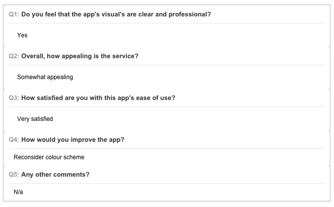
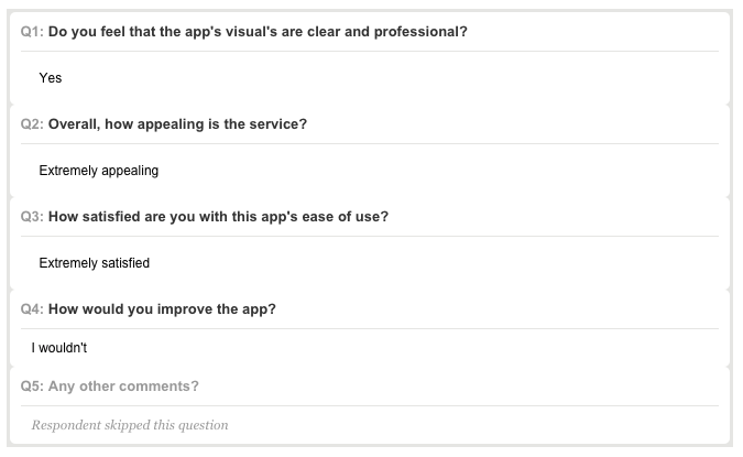
From looking at these results I can conclude that the app is aesthetically pleasing and generally well received by the target audience, with all of the responses being in the positive section of the results. However one of the results was defined at ‘somewhat appealing’, this was compiled with the statement of “reconsider colour scheme” – so in my next blogpost I will look at several different colour themes and compare against my current to decide whether or not a better suited colour scheme can be created.