METHODS OF PRESENTING WORK

I aim to present studentconnected through the use of iPhone templates photographed by myself at various locations and through plain background designs to fully showcase the apps designs.

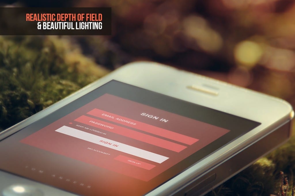
An example of one of the iPhone templates that I will shoot to display studentconnected:

7stunningmockups3-o


I will aim to shoot these within a university environment to reflect where the app will most likely be used. I don’t believe that iPhone & iPad mockup files such as this example with the use of forests and nature accurately represent the application. Locations that I will use include:

  • Lecture rooms
  • Workshop desks
  • Library

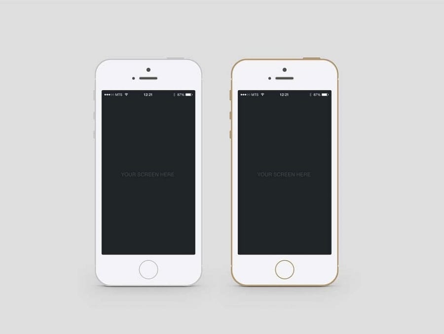
Another method of presenting the apps will be through solid colour backgrounds with multiple iPhone screens present to help showcase the various app’s pages. For example:

iphone-mockup-psds-23

This enables the viewer to see the apps designs clearly rather than at an angle within a university environment as shown in the previous image. These two methods I believe are the best way of presenting multiple layouts of studentconnected in a simple, clear and fast way.
DEVELOPMENT DUE TO FOCUS GROUPS

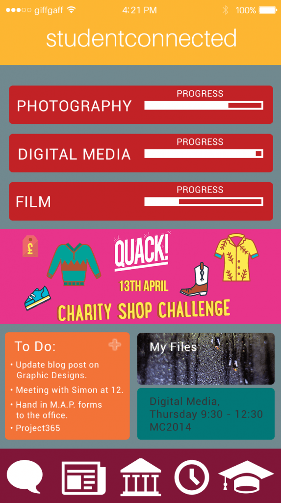
In my last blogpost I discussed the use of creating survey’s to receive feedback, I had my target audience of Students fill out the survey regarding the visuals of the app and how they felt by them. One of the improvements that were mentioned was the use of another colour scheme. In the image below I tried out another colour scheme using colours that complimented each other – however they don’t flow as well as the previous colour scheme. I personally dislike this new look and much prefer the older look of the studentconnected application.

supersurfer copy


In regards to this surveymonkey response, I have reviewed what they had to say and experimented with various colour pallets to find an alternative. Due to the other students who filled out the survey enjoying the original colour scheme, I will continue with this pallet as I find it much more enjoyable and complimentary of each other.

FOCUS GROUP REVIEW

I carried out a surveymonkey survey and sent it out to my target demographic, of university students to see what their thoughts where on studentconnected’s app interfaces and how I could improve. The next blog post will focus upon the statements made and the improvements created due to these comments.

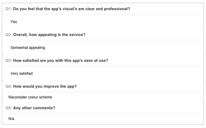
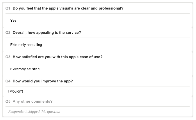
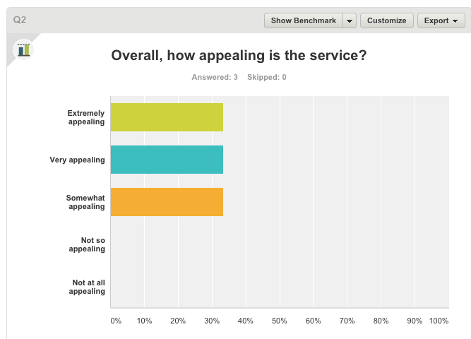
The following are few screenshots of results that were received:

Screen Shot 2016-04-14 at 00.04.55 Screen Shot 2016-04-14 at 00.05.38  Screen Shot 2016-04-14 at 00.05.47

Screen Shot 2016-04-14 at 00.06.21

From looking at these results I can conclude that the app is aesthetically pleasing and generally well received by the target audience, with all of the responses being in the positive section of the results. However one of the results was defined at ‘somewhat appealing’, this was compiled with the statement of “reconsider colour scheme” – so in my next blogpost I will look at several different colour themes and compare against my current to decide whether or not a better suited colour scheme can be created.

DEVELOPMENT OF WEBSITE CONCEPT

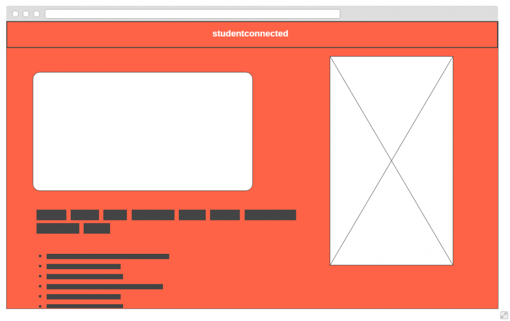
To accompany the studentconnected app I wanted to produce a website that would clearly layout the features and benefits of the app amongst its other educational application competitors. The following is an image of the initial wire-frame that I created within wireframe.cc, this was used to help give a basic layout when it came to creating the final website:

blogpost

The image on the right would be an image of an iPhone with the studentconnected’s interface on it, such as the homepage. Potentially an advert/video on the left hand side with text describing the product. This wireframe was used to help me keep an idea in mind of what I wanted when creating the site within Adobe Muse.

Adobe_Muse_logo

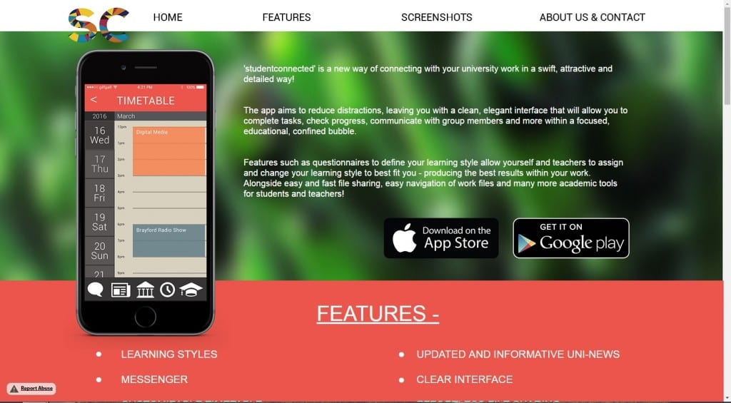
Muse is going to be used due to its flexibility and the use of business catalyst to publish the website to the online web – this will allow for quick updates and easy sharing. The screenshot below showcases the homepage of the website and how it has changed in comparison to the wireframe. Notable changes include no video, a photographic background and the image of the iPhone being moved to the left hand side.

df3195d37cfee78246526676ac3f42bc

You can view the rest of the website here:

http://studentconnected.businesscatalyst.com/

New interfaces

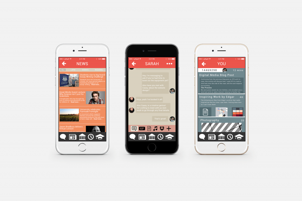
Since the last few blogposts I have created an additional 3 studentconnected interfaces, helping to show clearly what the app has to offer to university students.

These include:

  • University News
  • Messenger
  • Personal Timeline

Interface 3


These three interfaces showcase the layout of how they would be viewed by the student when using the app. They have all been laid out in a clear way to allow easy and fast access for students, letting them get on with their educational work and lifestyle without the hindrance of slow and complicated interfaces such as educational competitors like Blackboard. This was one of the main points made within the brief that I wanted to meet. All of these interfaces are relatively easy to understand and use, without any tutorials or assistance. Some of the interface designs are similar to other popular apps such as Facebook Messenger; this was purposely done to help students pick up the studentconnected app and immediately know how to use it.

These are the 3 features that are described on the studentconnected website that I wanted to visually show due to their complex nature and their openness to design – I wanted to show my take on these features.