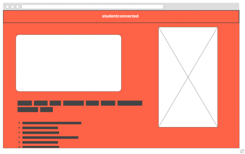
To accompany the studentconnected app I wanted to produce a website that would clearly layout the features and benefits of the app amongst its other educational application competitors. The following is an image of the initial wire-frame that I created within wireframe.cc, this was used to help give a basic layout when it came to creating the final website:
The image on the right would be an image of an iPhone with the studentconnected’s interface on it, such as the homepage. Potentially an advert/video on the left hand side with text describing the product. This wireframe was used to help me keep an idea in mind of what I wanted when creating the site within Adobe Muse.
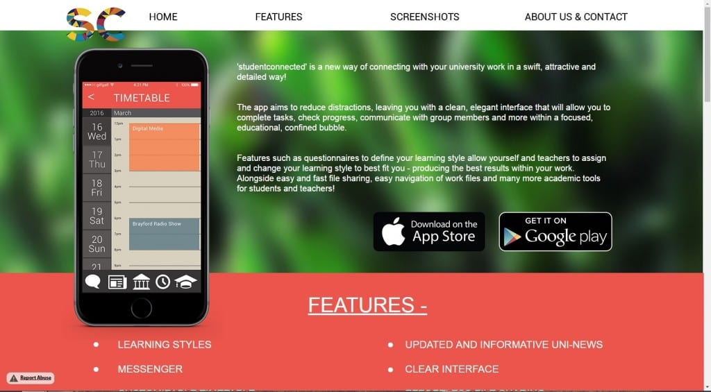
Muse is going to be used due to its flexibility and the use of business catalyst to publish the website to the online web – this will allow for quick updates and easy sharing. The screenshot below showcases the homepage of the website and how it has changed in comparison to the wireframe. Notable changes include no video, a photographic background and the image of the iPhone being moved to the left hand side.
You can view the rest of the website here:


