In my last blogpost I discussed the use of creating survey’s to receive feedback, I had my target audience of Students fill out the survey regarding the visuals of the app and how they felt by them. One of the improvements that were mentioned was the use of another colour scheme. In the image below I tried out another colour scheme using colours that complimented each other – however they don’t flow as well as the previous colour scheme. I personally dislike this new look and much prefer the older look of the studentconnected application.
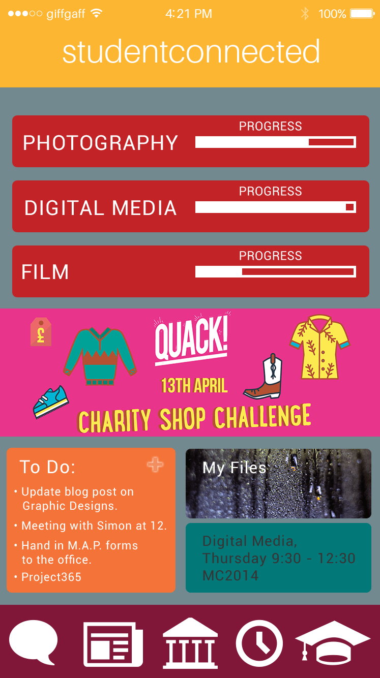
In regards to this surveymonkey response, I have reviewed what they had to say and experimented with various colour pallets to find an alternative. Due to the other students who filled out the survey enjoying the original colour scheme, I will continue with this pallet as I find it much more enjoyable and complimentary of each other.