DEVELOPMENT OF APP CONCEPT

This blog post will look at the development of studentconnected’s interface within the app – from initial wireframe to the final designs within Photoshop. Since the last blog post I have developed 6 interfaces, including the homepage, calendar interface, log in page, identify learning style page and more!

Below is the current version of the app’s interfaces:

Images 1

Interface 2

These images are what studentconnected looks like in its current state, I will get a focus group to look these interfaces and give feedback. A future blogpost will delve into the improvements I have received from the students and tutors who would be using the app on their mobile devices.

FURTHER DEVELOPMENT OF APP DESIGN

I have created many updates to the applications design, primarily the logo which has already seen many alterations from the original university cap icon to the simplified ‘SC’ version with multi-colour polygons throughout the logo. Since then I have updated the logo to have fewer polygons, allowing for a pattern of similar sizes throughout the graphic. Originally the logo had many of these large polygon shapes with one area on the ‘S’ letter that was concentrated heavily with smaller polygons. You can see the before and after below:

SC Logo- Vector


Before

SC Logo- Vector

After

This is a great improvement that keeps the consistency of the logo solid – I prefer this as it looks aestheticly pleasing, however since I have tried multiple versions of the SC logo such as grey scale polygons and a simple grey.

SC Logo- Greyscale

Here is the plain grey which I particularly like – I feel this would work on the red pixelated background as the apps icon. I will develop this within a future blog post.

SC Logo- Grey

How to Display App Prototypes

This blog post will be dedicated to the aesthetic style and blocking of app prototypes graphics usually used to present information and progress of a particular app. These types of graphics are usually seen in corporate flyer/hand outs and online portfolio websites such as Behance. I will be looking at two mobile apps called Medio Universitario & Memo, both of which are similar to ‘studentconnected’ in that they are educational systems within a handheld device.

The first app is Medio Universitario, which has a cartoonistic approach to the elements of the app which is clearly reflected in their prototype graphic:

d115ff33243567.56a9732b80333

I like the use of gradients within their work and the shapes used diagonally across different sections as opposed to horizontal lines to create new segments. This approach I feel helps the graphic flow while maintaining a clear and concise display of information. Both of these points I will take into consideration when designing my own app prototype presentations. I also find the use of mobile phone’s attractive in their positioning and scale throughout the piece, highlighting and detailing aspects of the app that may have been missed or skimmed over otherwise.

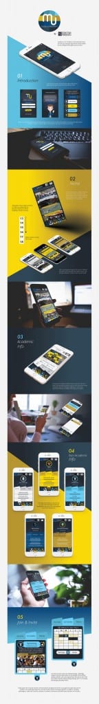
The second is ‘memo’ a similar app once again to ‘studentconnected’ this layout features many aspects that I find attractive when compared to the previous design:

c0cac813950571.56353f7819fc4284a9013950571.56353f764e643

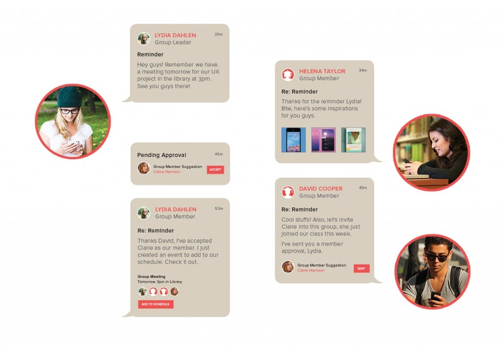
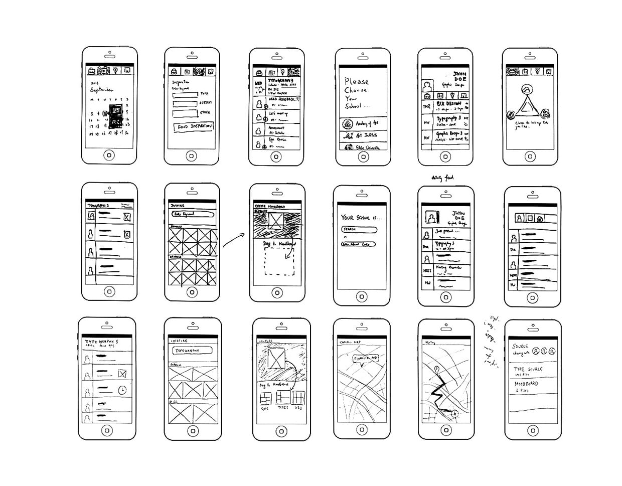
I particularly like the use of creating a presentation of this prototype in the stylization of an advertisement that you would most likely see on a billboard or digital poster, it feels more professional and true to the simplicity and colour theme of the app itself. I find that the drawings are also a nice touch to show development and another side to the production of this application. I find that this may be something that I will incorporate in my final presentation of my app, however instead of drawings use the wireframe.cc illustrations I created and discussed in a previous blogpost.

Updated logo

SC Logo- Vector

This is my current logo that most likely will remain as my final logo, however I have future adjustments I would like to make to this. I personally like the triangle shapes within the text as it personally reflects creativity and points of interest, the colours I feel also work together nicely and don’t clash.

Future improvements to be made to this logo include creating a grey scale version alongside a simple white version against a red background for the app icon. I also would also change the triangles to be a similar size – this is to protect the logo from losing quality should it be scaled down and smaller triangles become lost.

Going Indie Redesign

We were given the task of redesigning a page for an indie magazine about a person called Joseph Mirabello and his transition from AAA blockbuster games to the indie scene. The following two images showcase the before & after of my redesign of the publication:


Vertex Page 8 - Original

Before

Going inDIE

After.

I used sans-seriffed font, a slight gradient and created mosaic/pixelated blocks to create significance of the gaming genre whilst also adding colour to the overall publication.