Tasked with finding the definition of a good and a bad logo seems like it would be quite easy, however once you’ve got past the clearly blatant bad logos and start looking towards the multi-million pound companies that you see daily; you begin to look really in-depth as to the quality and thought put into and some of the elements behind the logo.
To me a good logo is something that represents the company in a clear and concise way, this should be done in two ways:
- The first is to have a logo that’s elements make up what you stand for, whether that be Costa Coffee, with their coffee beans boldly at the forefront of their logo or Wikipedia’s world built up of connecting jigsaw pieces with various written languages on.
- The second would be a logo that can stand by itself and be acknowledged clearly by the public domain. Perfect examples are Nike, Apple & Facebook, without the need for text cluttering up some products. Nike and Apple, are great at this with Apple’s iMac’s and iPhone’s clear black logo on the fore front of the products design. It’s instantaneous, you know who it is – Nike are the same with their famous tick on shoe boxes & TV advertisements.

The three logos that I specifically chose as ‘Good Logos’ were Apple (surprise, surprise!), Google and Buffer, the scheduled tweeting app. The one I will be focusing on in this blog post is Google as I’d like to talk about the recent changes that have appeared on everyone’s homepage. If you use Bing, please stop reading now…
The Google, logo that we all knew and loved was present on our homepage from May 31, 1999 to May 5, 2010, since then there have been a few facelifts and adjustments, but nothing too different from the norm. On 1st of September 2015, we saw a whole new logo, something completely different from what we had seen before. This wasn’t just removing the shadow, or flattening the image, this was BIG!
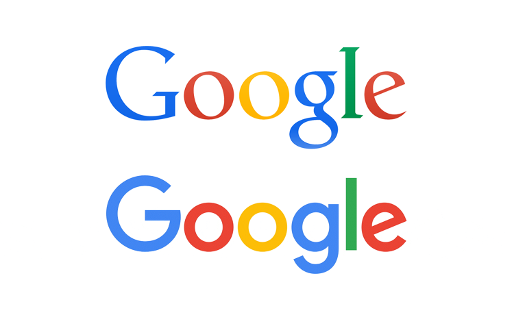 Straight off the bat you can see that the new logo is completely sans serif with a simplified look; when I saw the logo for the first time I disliked it – I believed it to look unprofessional, drastically different and a bit ugly. Over the following weeks this logo has grown on me to the point where I feel it represents Google in a whole. No longer do they look like a scary, billion dollar corporation that’s going to take over the world; we are left with a very playful, creative and bright logo that represents Google as a whole. Upon first viewing the logo I believed it to be very childish looking due to the type looking like lettering you would find on children’s wooden blocks, maybe that’s the point with their new parent company called ‘Alphabet’ after all. I felt they had pushed the logo past simplification to the point where it seemed unprofessional. Although giving myself some time to think, I realised that Google, as a whole is a company that has its fingers in many, many pies and is involved in so many areas experimenting, building products and providing a service – that this new modernised logo gives off connotations of how they want to be represented which is a bold, creative and playful corporation that are friendly and not trying to take over the world by monopolizing. It has also been discussed that Google and many other large corporations try to hook young children onto their services by making their logos easy to read though streamlining and flattening. I also believe that in our day to day lives we need to recognise a logo within 1-3 seconds due to the fast speeds that society works at when on their smartphone devices; a small logo icon that can be recognised on the side of a building, or a billboard is just as effective.
Bad logos are everywhere – I think that’s a given, whether it be a local companies plumbing service or a multimillionaire company such as ‘Boots’. They come in all shapes and sizes and logos have evolved to the point where ‘bad’ logos have started to fade away, its relatively simple to create good looking logo in 2015 with websites helping you build them in seconds. Still it seems that for some large companies it’s still just as easy to screw up…
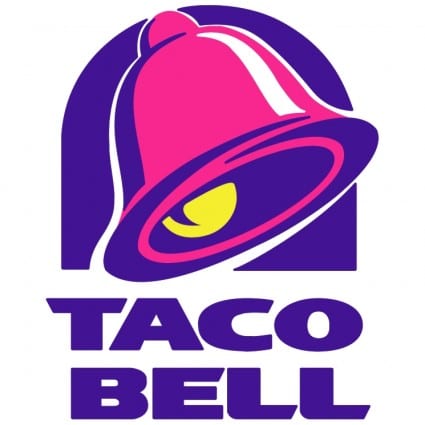
An example of a bad logo would have to be Taco Bell, I can’t think of a more clashing and eye hurting logo than that; if you can please leave a comment as I’m reluctantly curious. The colours are wrong and completely destroy whatever Taco Bell want potential customers to think. Fresh, tasty tacos is the last thing on my mind when I see this logo, I feel with a pastel colour palette, some flattening and the complexity of the logo’s details rearranged it could achieve a higher quality look. The pink & purple distract and could potentially capture a customer’s eye when walking on a street however it’s for the wrong reasons.
The previous segment to this blog focused on why these logos are deemed as ‘good’, and how Google recently undertook a major revamp, although they were not the first to dabble in this area – it was actually Microsoft & Ebay, major giants in who have almost pioneered this change.
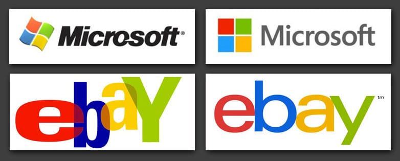
Microsoft not only changed their logo but their entire operating system with the ‘Metro’ look introduced in Windows 7, that blurred the lines between computers, laptops and with the rising tablet – this flat look was deemed ugly, basic and immature when it first launched years ago. It is no surprise that years later other giants have followed in their footprints and a huge culture shift has happened regarding logos and how we as a society receive and perceive data.
In conclusion, I see logos as a whole are at, or are approaching their mid way point in their evolution of this flattening, simplified stage. Since 2010, logos have slowly snowballed in this direction and it’s at a point where small businesses will begin to copy and emulate these stylizations they are seeing larger corporations put into effect. Over the next 5-7 years we will reach a point where a new post-simplified version of logos will emerge, I have no idea how that will look and most likely neither do you – but more detail and clarity will be taken into account when new logo designs are being created. There isn’t anywhere to go from this point except merge the two & sprinkle in new design ideas to create a unique hybrid we haven’t really seen before.