An Idiot’s Guide to Projection Mapping

What is it?

Projection Mapping, is one of those things that everyone has seen at one point in their life and may not realise the extent of its applications or remember its name. Projection Mapping is best described as using a projector to produce a graphic that interacts with our real life surroundings – whether that be as a ‘spread’ graphic that plasters an entire wall, ceiling or floor or is used accurately to pinpoint animated graphics onto objects to create a ‘show’. I was taught projection mapping’s principles, advantages and uses in a recent workshop for Digital Media with Clive McCarthy. This was especially interesting as Lincoln, has the upcoming Frequency Festival that heavily relies on projection mapping.

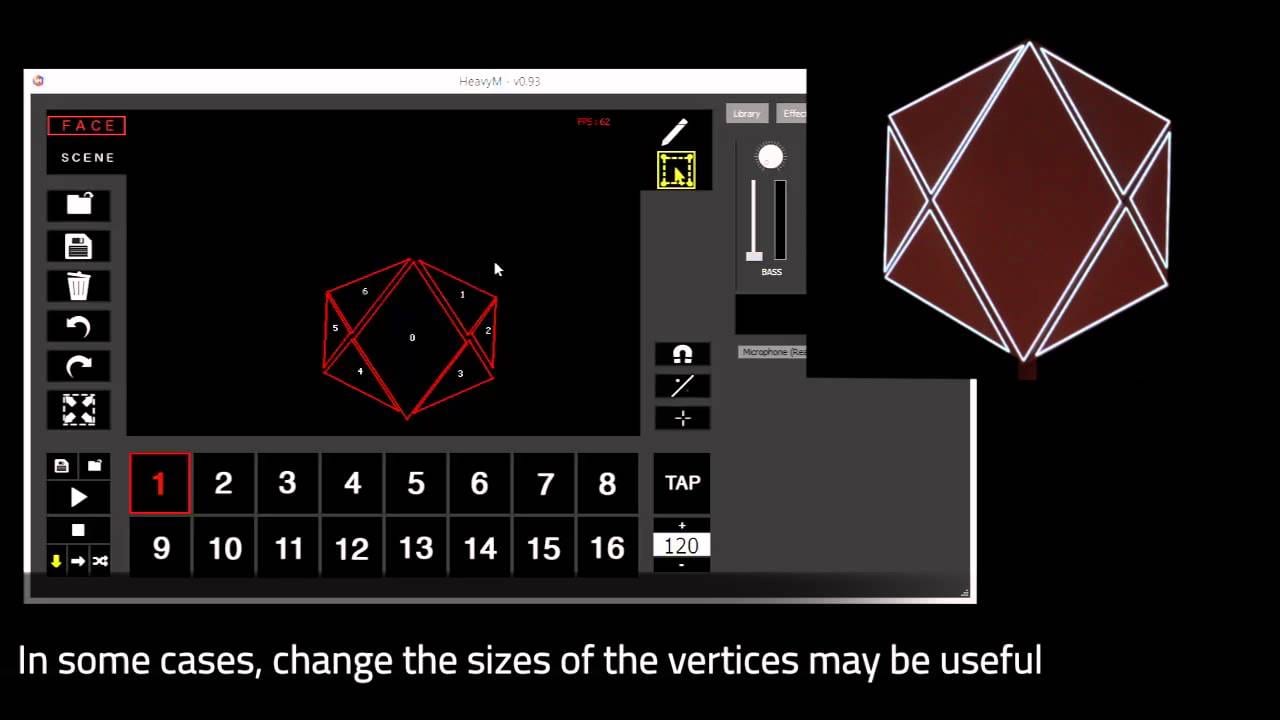
The effect is achieved by using a projector to project images created on the fly with apps such as Dynamapper on the iPad, or software on the Mac/PC called HeavyM, a recent spatial augmented reality piece of kit that allows you to change shapes, images and videos with point precision in real time allowing to achieve immersive experiences. HeavyM, is one of the best that I’ve seen for editing graphics, especially with their special effects that can be animated and triggered on sounds – a great use for a show that includes sound. The apps and programs will be discussed later in this article.


Examples of Projection Mapping : –

As previously mentioned projection mapping is one of those things that we see all throughout our lives but never really pay attention to it and fully acknowledge it until its pointed out or notice it and then all of a sudden we start remembering various instances as to where we have seen it. I had the same thing happen to me when discussing projection mapping within the workshop – I remembered that in the summer I witnessed projection mapping on the castle within DisneyLand Paris but never connected the dots until I began thinking where I had seen it applied.


I also remembered what I think is one of the most advanced and impressive examples of projection mapping – a short film that introduces a moving projector and how it interacts with a box.


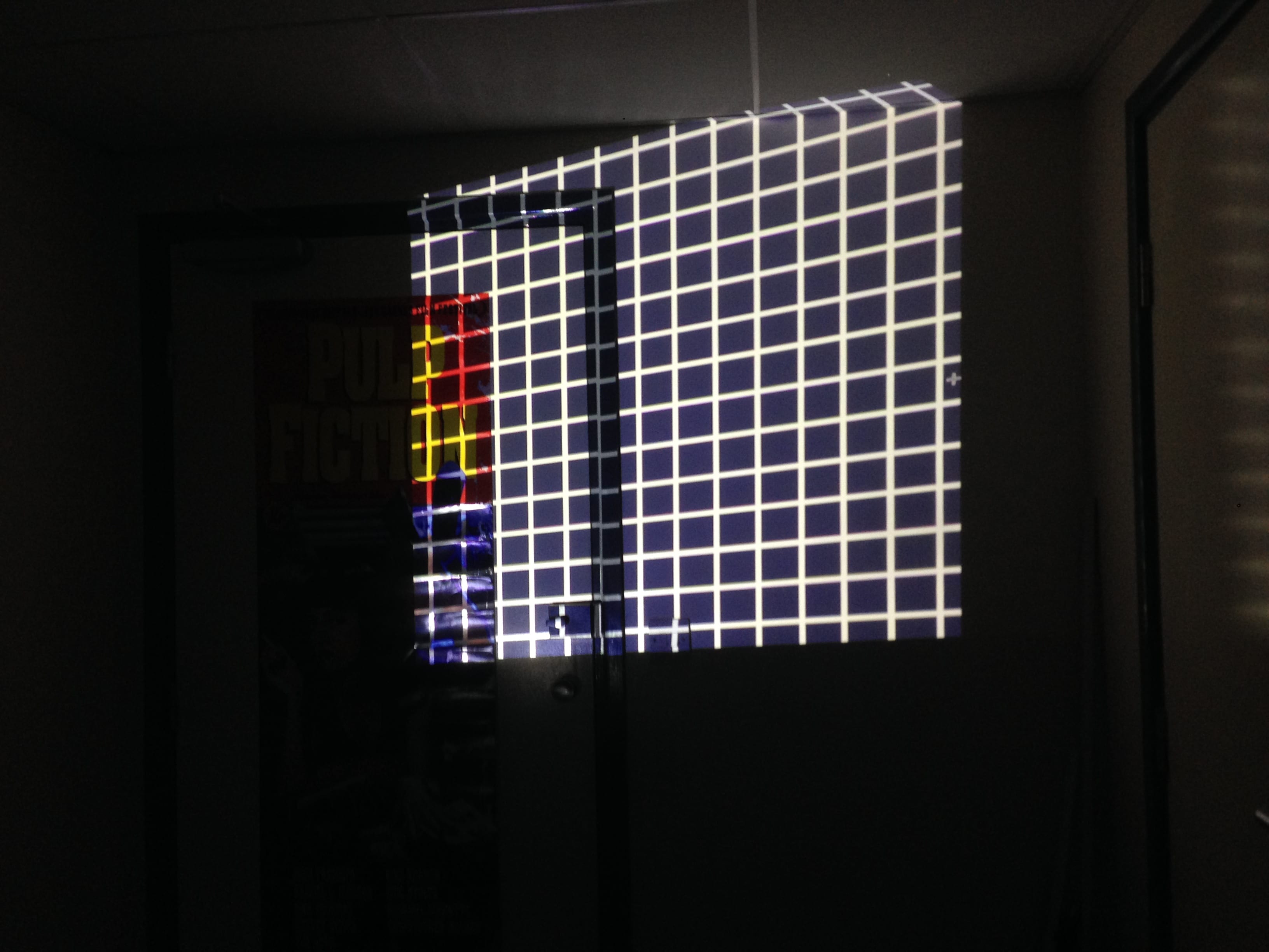
I booked out a projector from media stores at the university and began playing about with different graphics and exposure’s through an FS100 camera. I created a grid graphic within Photoshop as I believed it would help show edges and curves, especially on someone’s face.

IMG_5687

IMG_5689

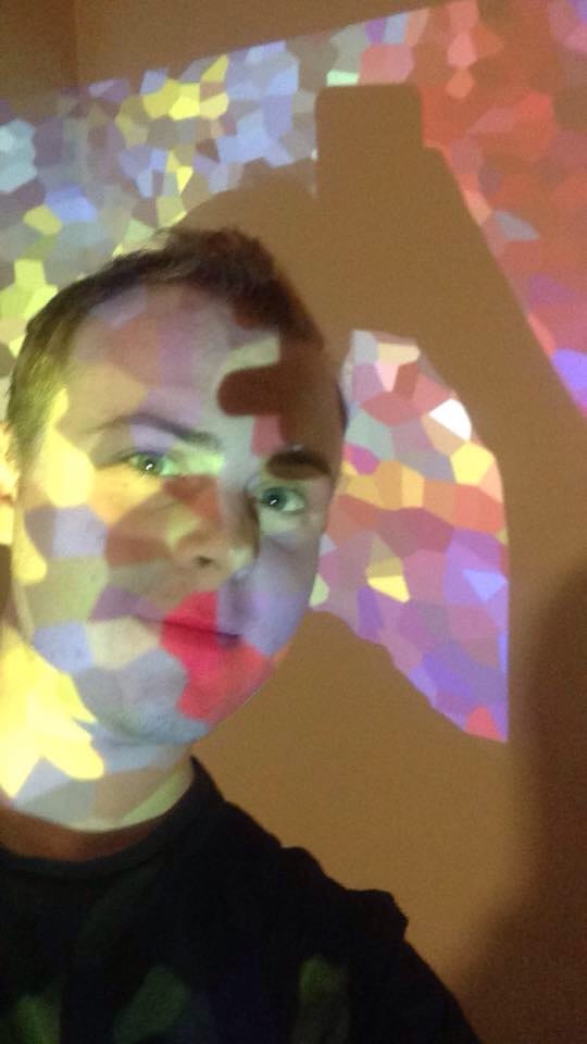
I also created a pixelated graphic that moved slightly – I found that this would be extremely creative in the use of a background for when interviewing a subject.

Untitled-1

IMG_5698


Apps & Programs Used: –

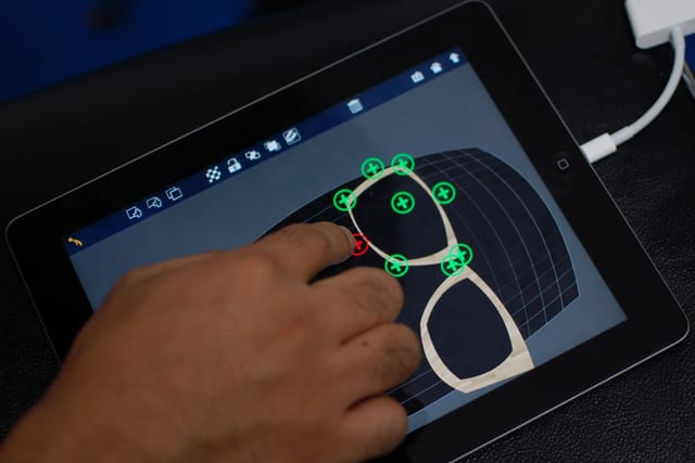
Projection mapping can be achieved in several ways, however the most easiest is probably through an app called Dynamapper, which is as simple as plugging your iPad or iPhone into the projector and you’re off! Dragging and dropping various points on the surface of the tablet is incredibly easy and fast to achieve. These shapes can be switched into various moving graphics, or stills which can be used in whatever way you want. Your creative drive is the limit! A more advacned piece of software can be used – HeavyM is a recent tool-kit that allows you to change shapes, images and videos with point precision in real time allowing to achieve immersive experiences. HeavyM, is one of the best that I’ve seen for editing graphics, especially with their special effects that can be animated and triggered through sounds – a great use for a show that includes sound.

maxresdefault

141006_mapping_03

Applications in Convergence Task: –

The Convergence Task could use projection mapping in a variety of ways to present data, enhance a visual aesthetic or push the narrative into unknown territories. At this current moment in time I have a few ideas as to what I could do with the equipment and ideas I have been taught with in the workshop – although nothing is set in stone. Most of the ideas I have are based around projecting onto the subject of the film, which would be myself as its a self reflective film; I don’t believe I would use it heavily within the short video as its not something that I currently engaging with – I’d rather focus on the many, many other digital and personal hobbies and applications that I work with on a day to day basis.

I find that I am someone who is constantly looking towards the future, always trying to experience new opportunities; I have my fingers in many pies so to speak – and projection mapping is something that I am now interested in, so it could be an effective way of putting that message across in the film.

New and Useful Design Trends That Will Create An Engaging Brand

Domestic Animal Behaviour Centre Branding

As part of our Convergence journey, we have continued our progress with logos and branding, this blog entry focuses on how myself and my team responded to a brief set by James Field.

The brief was a simple one in that we were to design a logo for a new domestic animal behaviour centre that would “appear on a range of different marketing outputs and business documentation.” They wanted to be branded specifically close to dogs and their owners with other animals such as cats and rabbits being a secondary demographic. I felt that a logo that can be recognised as a professional, educational and qualified would positively reinforce the company’s values to potential customers & partners.

Initial Ideas:

The group and myself said that we would focus on our own ideas and build upon then before later meeting to discuss our findings.

In the last blog post I looked at logos and their vast imaginative urges to reform and experiment and what the current contemporary trends were – I came to the conclusion that flat design is currently at its midpoint and that a mix between flat and skeuomorphism would be the trend in the next 3-7 years. One of the ideas I had was to incorporate a mix between the two but lean more towards the flat design as I feel it’s friendlier and would give an aesthetically pleasing look while also appearing professional, respectful and playful which is the clients wanted. The decision to have this mix was to give the logo a longer life period. I too thought that pastel colours would work well with the flat look as pastel colours tend to give off a very minimalistic stylization that could potentially be eye pleasing.

The dog was the main emphasis in all of my logos with secondary animals such as cats, rabbits and birds being in the background of the logos or not of as significance – a point in the design brief that the client clearly wants addressed. Silhouettes happened to be quite frequent in my research of other animal logos, mainly with the smaller animal being encapsulated within the larger; in my first few logos I addressed this by using silhouettes in a different, unconventional way.


Concept Logo Development:

The group and I discussed that the animal behaviour centre’s initials stood for ABC and considering that they clients wanted an educational approach we thought that this might be a clever way of doing it. I began adding new elements over the first 3 logos before finally settling on one I liked and would develop further.

Logo 1

Logo 2


Logo 3

The third logo is very similar to the logos seen in shops such as ‘PetsAtHome’ and other animal related business. I took this and developed the colours as after speaking to members in the group we came to the conclusion that the logos colours gave off a very scary and doom impending corporation which you wouldn’t really want to leave your dog with to attain better behaviour.

Logo 4

Logo 5


Logo test 2


A colour wheel was used to produce the colours for the fourth logo, these fit very well and don’t clash, although the basic shape elements of the logo are still in the over used animal inside of another animals silhouette. This is why in the 5th and 6th logo a Ying and Yang effect was brought into effect with colours that represents them as opposites. This was done as it gives the impression that one is good and one that is bad – this links into the animal behaviour centre in what they do to help train and calm down unobedient pets.

Logo test

Logo 6


Triangle - Pick 2

Fine tuning was used on the colours of the logos to produce this final look – I found that when creating these logos that there is a triangle with 3 points focusing on different matters, and that you can only pick 2 without harming the third point. The logos above I feel have a professional and aesthetically pleasing look but don’t look fun. This brings me onto my next logo which I designed to be more fun.

Logo 7


The mix between skeuomorphic and flat design was used here to create a cartoon dog that was detailed with shadows, gradients and additional features. The French Bull Dog has a very fun and friendly vibe to it which in retrospect feels like it would be more suited for getting children to engage with a particular subject revolving around dogs. This logo doesn’t focus on tackling the domestic animal behaviour centres role in society; it doesn’t show what the organisation does other than the text obviously stating it. In regards to the triangle it fits a fun and aesthetically pleasing specification that the brief mentions but lacks any professionalism and would make the brand as a whole suffer.

From this point on I think that if I could find a midpoint between these two logos detailed above I would find a logo that would be very equal within the triangle and produce a brand image that would give off the right amount of fun and friendliness while still showing how engaged and professional the company is.

Team Effort:

The team and I used Google Drive/Docs to work simultaneously and communicate on each others progress as it happened allowing for us to work effectively and efficiently – we responded to the brief together with different colours representing each member of the group, before mentioning research and uploading our logo progress. Toby. created several logos that I thought used negative space really well however the colours seemed too clinical and didn’t give off a warm feeling.

Design 4Design 3


The second logo was created into a vector through Adobe Illustrator so that the domestic animal behaviour centre could potentially scale up and down the logo to work on a business card or leaflet to a billboard advertisement with no loss of quality. I will focus heavily on the practices and knowledge learned in the last two workshops when designing my very own brand in conjunction with the ‘One Minute Wonder’ project we have been tasked with.